Case study
Brooklyn
Brooklyn Apparel is a luxury-athleisure hat brand designed for modern city life. Their principles? Minimalist silhouettes. Premium materials. and a quiet New York confidence. I built the full brand identity from scratch, including the logo system, visual language, packaging, product design, and web look & feel.

Process
Serving New York
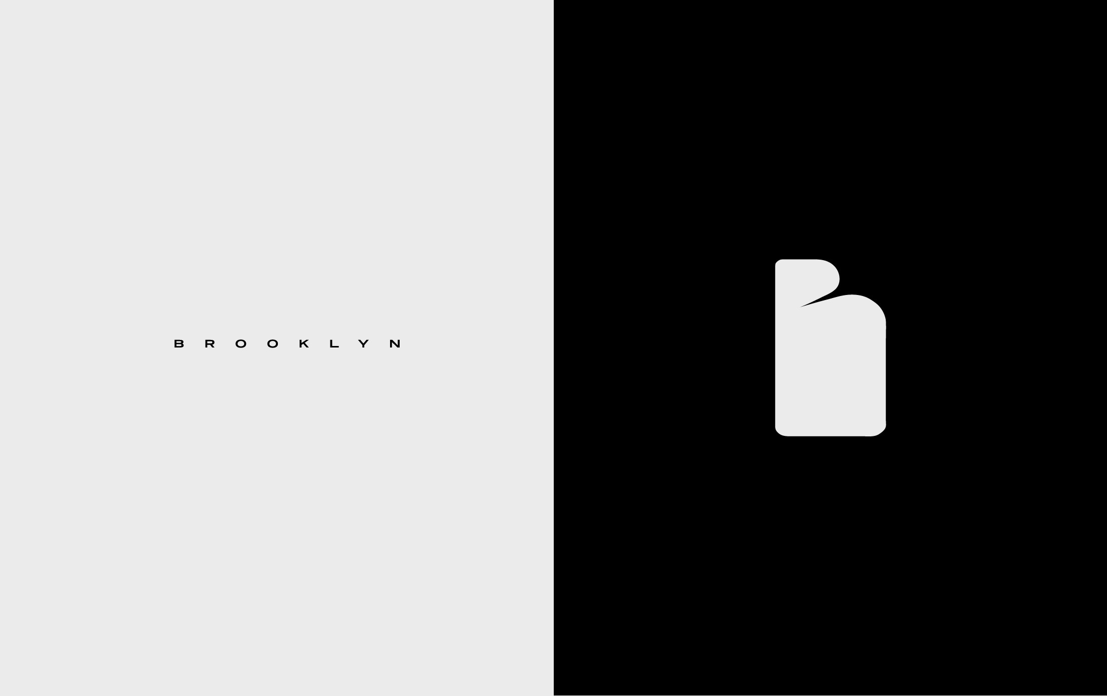
Brooklyn needed an identity that felt unmistakably New York without slipping into cliché. I began by stripping the brand to its essentials: geometry, proportion, and restraint. I then translated their essence through a luxury minimalist lens. The result is a visual signature that feels light, luxe, and distinctly New York.
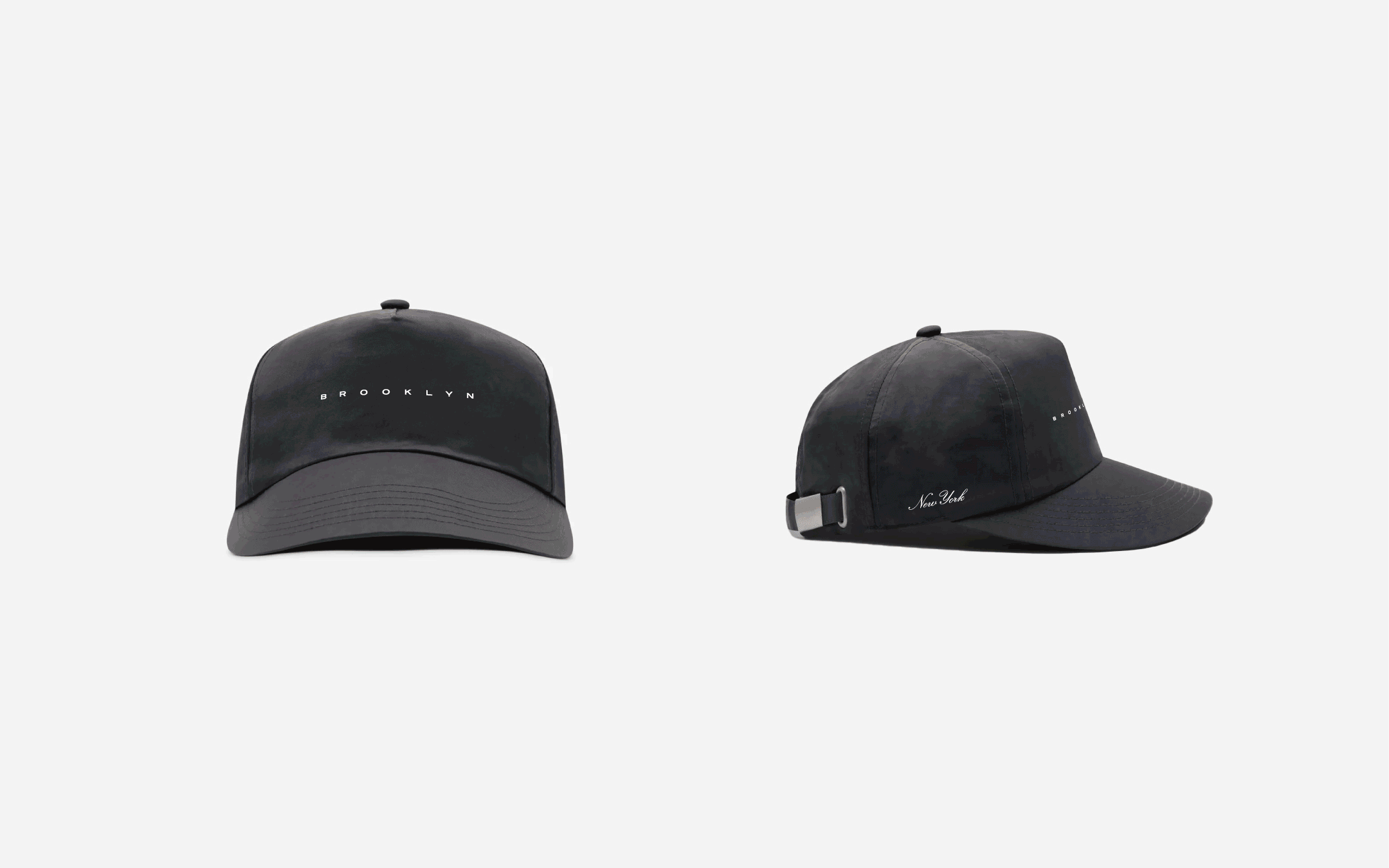
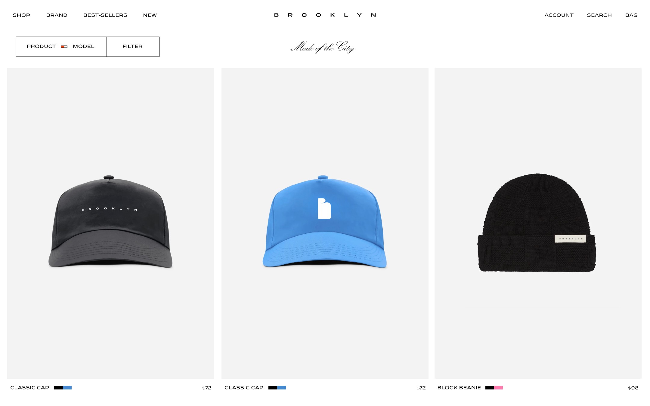
Making forms feel … crisp
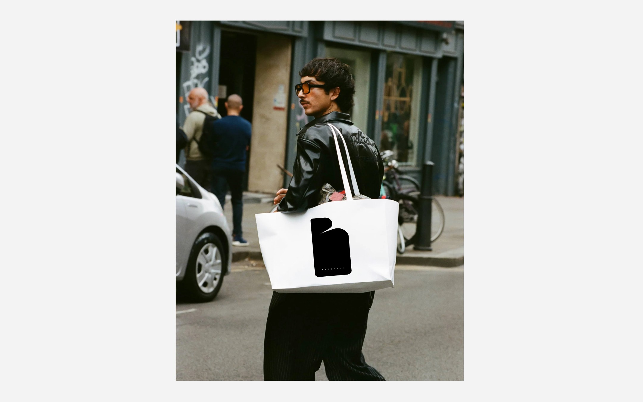
The logo system was engineered to behave like a design object: sharp, spacious, and instantly recognizable at micro or macro scale. On-product applications (caps, beanies, trims) were treated with the same precision as high-end athleisure hardware. Bags followed suit with clean, tactile forms that elevate the walking around town experience without unnecessary noise.
Outcome
Flowing From City to City
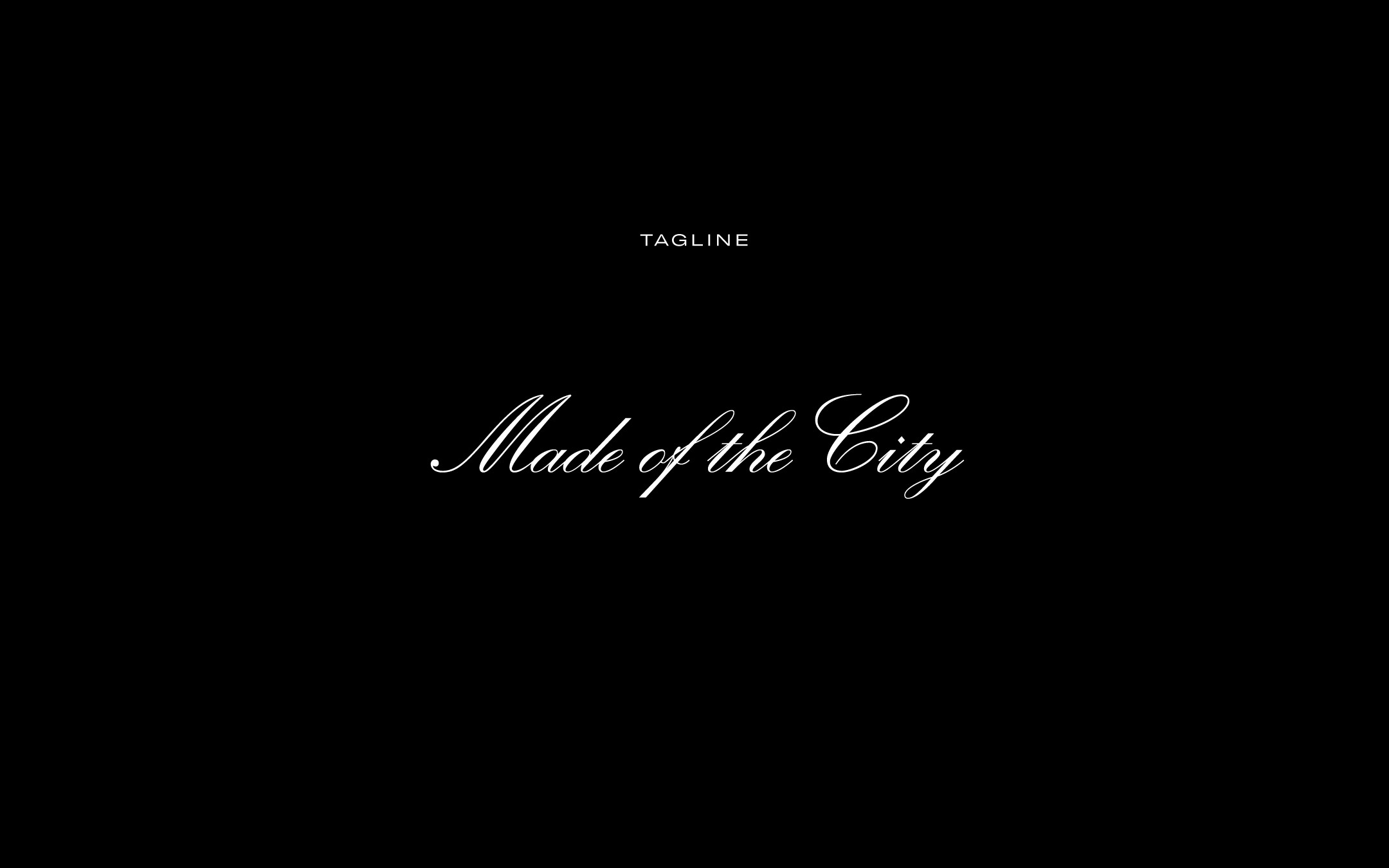
The final identity positions Brooklyn Apparel as a luxury-athleisure brand with real urban authority. The “Made of the City “ tagline sits at the center of the story. It not only ties the product to place and culture … but to an attitude New Yorkers recognize immediately.
A Foundation Built for Expansion
The elevated aesthetic that stands apart in the streetwear category: sharp lines, essential style, and a tone that feels both exclusive and understated. Brooklyn’s identity system is robust enough to support future collections, collaborations, and campaigns. It’s a foundation designed not just for launch, but for longevity.